Premier League top goalscorers’ body parts

Manchester City and Opta’s release of data is fantastic for people that like football and quantities. So fantastic, in fact, it is hard to know where to begin playing with it. Something that first caught my eye when running through the spreadsheet of player-by-player, match-by-match tallies (the Full data) was the separation of goals and goal attempts by left foot, right foot and head (and ‘other’).
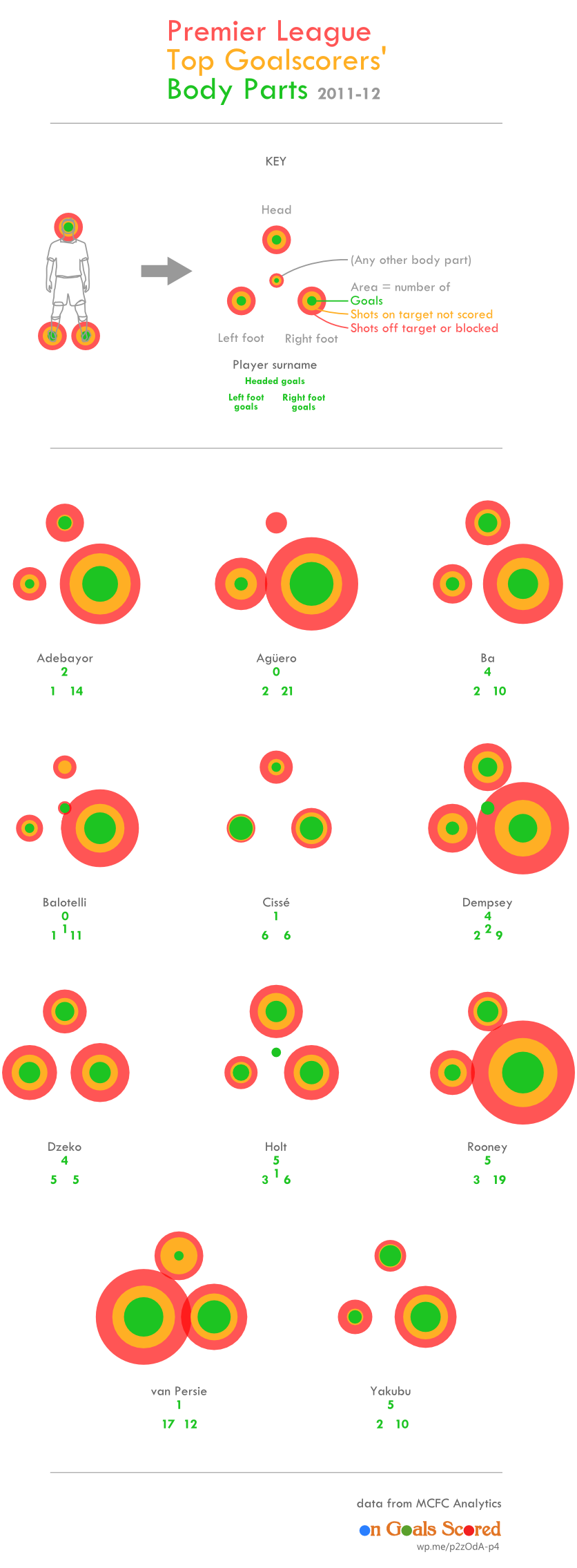
Below are the players that made the Premier League top ten goalscorer list for 2011-12 which, since 10th and 11th place were tied, is eleven men. For each is a set of circles representing the number of goals and goal attempts from their head, left foot, right foot and other body part.
- Adebayor, Agüero, Ba, Balotelli, Dempsey, Rooney and Yakubu significantly favour their right feet. They aren’t completely one-sided as they each managed at least one left-footed goal – but perhaps they only employ lefty for tap-ins.
- Neither Agüero nor Balotelli registered a header.
- Edin Dzeko is very well balanced. He could be nicknamed ‘The Gyroscope’ but probably won’t.
- Papiss Cissé is lethal with his left foot. Only 3 of the 9 left-footed shots he attempted all season failed to find the net.
- Although Robin van Persie scored more with his left foot, he used it for quite a few more attempts so he had a better conversion rate with his right.
- The ‘other’ goals: Mario Balotelli casually shouldered the ball into Norwich’s goal after the ball popped up from a John Ruddy save (3rd December). The ball rebounded off Clint Dempsey’s right knee into Newcastle’s goal after a Tim Krul save (21st Jan). Dempsey scored another kneeer after a save, also by Ruddy, bounced onto him (31st March). Grant Holt connected with a freekick cross with his shoulder/chest to score against Aston Villa (13th May).
A NOTE ON CIRCLES
Using variations in the area of circles to represent values is a favourite pursuit of many a data visualiser. This is unfortunate because the human eye and brain aren’t very good at perceiving the relative size of circles with any accuracy. Taking information from the size of rectangles of uniform width (bars) is far easier. Ease of information intake from the reader should be the first priority of data visualisation. So why use circles?
- One: Bar charts can be awkward if your values are different by orders of magnitude. If your biggest value is much higher than your smallest (but not high enough to justify a logarithmic scale), either your smallest bar will be almost invisible or your biggest will force your image to be very tall or wide. Circles suffer from this problem less as they spread in two dimensions. You can use squares as a compromise but they don’t benefit from reason three.
- Two: Symmetry. A bar chart needs two dimensions for an x-axis and y-axis, however your graphic may have already employed the dimensions for something else, such as the layout of a pitch or the relative positions of body parts. A circle radiates equally in all directions from a single point so doesn’t infringe on other meanings applied to the space in the same way.
- Three: Circles are sexy. Circles are cool. Circles are fun. Everyone loves circles. Using circles instead of bars is the easy (lazy) way to make a stuffy, old graph or chart appear to be an interesting, modern data visualisation.
Reasons one and two were definitely motivations for my use of circles in this post but, I’m ashamed to say, so was reason three and, in doing so, I have compromised the effectiveness of the visualisation for an attempt at aesthetic gain. I hope you can find it in your hearts to forgive my shallowness on this occasion… and the occassional past occasion… and inevitable, occasional occasions in the future.
